Threshold Bar Chart #
Introduction #
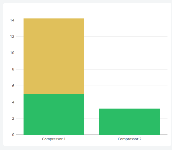
The Threshold Bar Chart displays the latest value of one or more datasets as bars, with each bar split into two stacked segments: the portion up to a configured threshold and the overflow above it. Each segment is colored independently, so a single glance reveals both the current value and how far it exceeds its limit — ideal for budget-versus-overage style monitoring.
Features #
- Per-dataset threshold value with separate base and overflow colors
- Stacked-bar rendering of base + overflow segments
- Custom title and color per dataset
- Optional Y-axis display (hidden by default for a compact look)
- Configurable auto-refresh via
updateFrequency - Click a bar to open the dataset chart dialog; Ctrl+click to add datasets to a multi-selection
- Copy chart to clipboard from the mode bar
- Supports multiple datasets side by side on a shared X axis
Use Cases #
- Monitoring resource usage against quotas (e.g., energy budget vs. overage)
- Visualizing equipment load relative to rated capacity
- Tracking KPIs against operational targets with at-a-glance over/under signaling
- Comparing several assets against their individual thresholds in one view
Example #