Radar Chart #
Introduction #
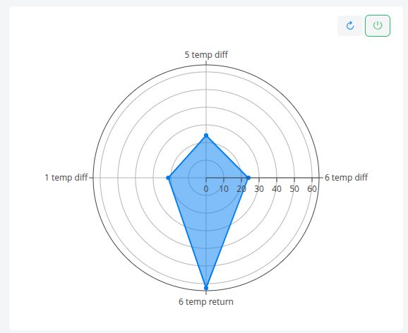
The Radar Chart compares multiple datasets on a polar plot, with each dataset represented as an axis and the peak value of that dataset over the selected time range plotted as its radial position. The connected points form a filled polygon, making it easy to compare the relative magnitudes of several signals at a glance.
Features #
- One axis per dataset, with custom or overridden axis labels
- Plots each dataset’s maximum value over the selected time range
- Automatically closes the polygon for a continuous filled shape
- Optional fixed radial range (
rangeMin/rangeMax) for stable cross-period comparison - Optional date selection control
- Configurable auto-refresh via
updateFrequency - Configurable height and dynamic-height support
- Copy chart to clipboard from the mode bar
- Optional custom trace name for the legend
Use Cases #
- Comparing peak loads across multiple equipment groups or assets
- Visualizing a multi-dimensional KPI profile in a single shape
- Highlighting imbalances between several related metrics
- Benchmarking current period peaks against fixed reference bounds
- Quick visual diagnostics across several sensors or signals
Example #